Welcome

This blog lets you see what my team and I will be doing towards our AS Media. The theme is horror and we will be posting new short films.

Tuesday, 29 January 2013

Title Font and Colours

We are looking at what font and colouring we should use for our opening sequence.

Production Name- Our production is RANK and for the first clip we will need to show our logo and production name we would like to present it with the colour red as red is normally portrayed as blood and will go well with our plot 

Logo- For our logo we would have come up with several logos and think that our best one is the droplet of blood this is because in our task we will have blood and it will go well with the colour of our production name .

Credits- For our credits will are looking at a website called "Da Font"( http://www.dafont.com/ ) where it has many font for us to chose which one will go best we the theme of our plot. As an example we have though about using a font called "Frisky Vampire" but we do not want to use the same font for the title of our task so we have not decided whether or not to use it but we have decided that since we have changed the plot we have any dark scene so we thought that the credits should be in white so that they are contrasted with the clips.

Title- Our title for our main task is called "More Than Human" we chose this because it because of our plot our main character (Anna Smith) has just escaped a mental institute after being diagnosed with Hallucinogen and has had some unusual side effects which is why we think "More Than Human" is appropriate. We are going to see what the title looks like in "Frisky Vampire but we know we will want it in a blood red colour to assure the target audience that it is a horror film.

Monday, 28 January 2013

Production Name Logos


After lots of logos that one of our group member Aalisha has drawn out on her software where it allows her to draw free hand on it then transfers on the computer we have decided to go with the simple blood droplet because we think that the simply logo contrast our main task but at the same time allows the audience know what film they are about to watch. 
As you know R.A.N.K stands for all of our team names Rosaline, Aalisha, Naomi and Klodiana which is why we thought that it would make a good production name not only that but the word "Rank" is a slang word for disgusting which i think suits our main task perfectly.


These are some of the other logo that we cam up with 

This one has a puff of smoke behind our production name we thought it was good because it adding mystery to our task.


This one was my favourite because I thought that the compas symbol went well with the personality of the character because of her being mentally ill.


This logo was design the same way as the one we are going to keep but this one has barb wire around the Rank 


Production Title

Our production name is R.A.N.K we chose this name because the first letter of each of our names spell it R(osaline) A(alisha) N(aomi) K(lodiana) but the word R.A.N.K can also relate to our target audience (young adults) because the word Rank is slang for disgusting.

Sound Effects


We also thought that some of this particular clip would be great for some intense dramatic effects in where a shock or a jump is needed.

Soundtrack Ideas 2


We thought that this soundtrack would go really well when Anna Smith is running to the house but we will not use all of it but from 0:30s - 1:35s we will pick out the best parts that build up suspense and make her running more dramatic.

Soundtrack Ideas 1


We thought that part of tjhis soundtrack could be use for our flashbacks clips.

Tuesday, 22 January 2013

Make-up Practise


I tried to create a bruise on my arm and for that I got inspiration from a youtube clip I viewed
I got really annoyed by her voice so I watched it muted and though of what went right on the bruise.


 For the bruise I used mostly eyeshadow but also used a bronzer and red lip gloss.


After the brusie trail I also looked up on how to do a cut and for this result i used the youtube clip below 
I didn't follow the steps shown in the clip because I didn't have all the right material so I improvised with what i had also the cut in the video looks like it is healing when we want a cut that looks like is was done recently.

These are the material I used for the cut i used mostly red pen to emphasise the cut line.

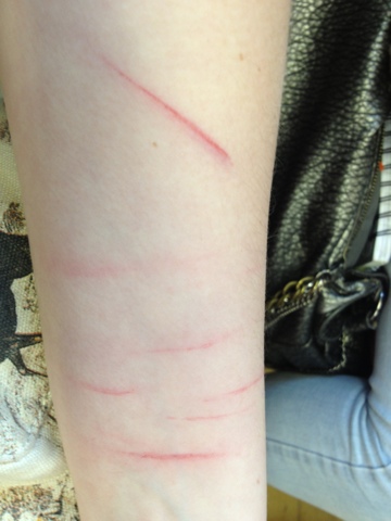
Here are some more practise I did the next day on the rest of our group I did some cut on arm and a cut on a lip.


I also tried to create a bruise and place it around a eye, we took the photo about 3 1/ 2 hours later so by then it was really shiny but it still looked really good and some of our teachers and classmates thought it was real. 


Here is the make-up on the the actor the way it will be done on the day of the filming here are some photos of the bruises around her eye and cuts on her knee and arms the bruise on her knee will be done when she falls down infront of the house she later breaks into.